How to Choose a Color Palette for Your Brand (Free)
To choose a color palette, start with one brand color, add an accent from a different part of the color wheel, then add a dark neutral for text and a light neutral for backgrounds. Three to five colors are enough for almost any site, deck or logo, and the proportions matter as much as the colors: roughly 60 percent neutral, 30 percent primary and 10 percent accent. This guide builds a small palette step by step (a teal primary, an amber accent and a slate text color), shows the exact HEX, RGB and HSL values in GrabCast's free Color Converter, and checks the contrast so your text stays readable.
🎨 Try Color Converter (HEX RGB HSL) now — freeOpen →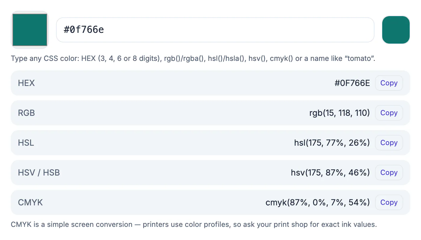
Every extra color is a decision the reader has to interpret. A short, consistent palette makes a design look intentional, keeps buttons and links recognisable and makes it easier to hand a design to someone else: they need a handful of values, not a folder of screenshots. A palette also protects accessibility, because you can test the few text and background pairs that matter instead of every combination.
Start with one primary color
Pick the color that should carry the brand: the one in your logo, on your buttons and in the headings. In the example the primary is a deep teal, #0F766E, which is rgb(15, 118, 110) and hsl(175, 77%, 26%). Type it in the Color Converter and copy the format your tool needs; design apps usually want HEX, CSS can use HEX, RGB or HSL, and print work needs CMYK (a rough screen conversion, so ask the printer for exact values).
HSL is the most useful format for building a palette because you can see the three ideas separately: hue (the color, 175 here), saturation (77%, how intense) and lightness (26%, how dark). Changing only the lightness gives you a matching lighter or darker shade.
Add an accent and neutrals
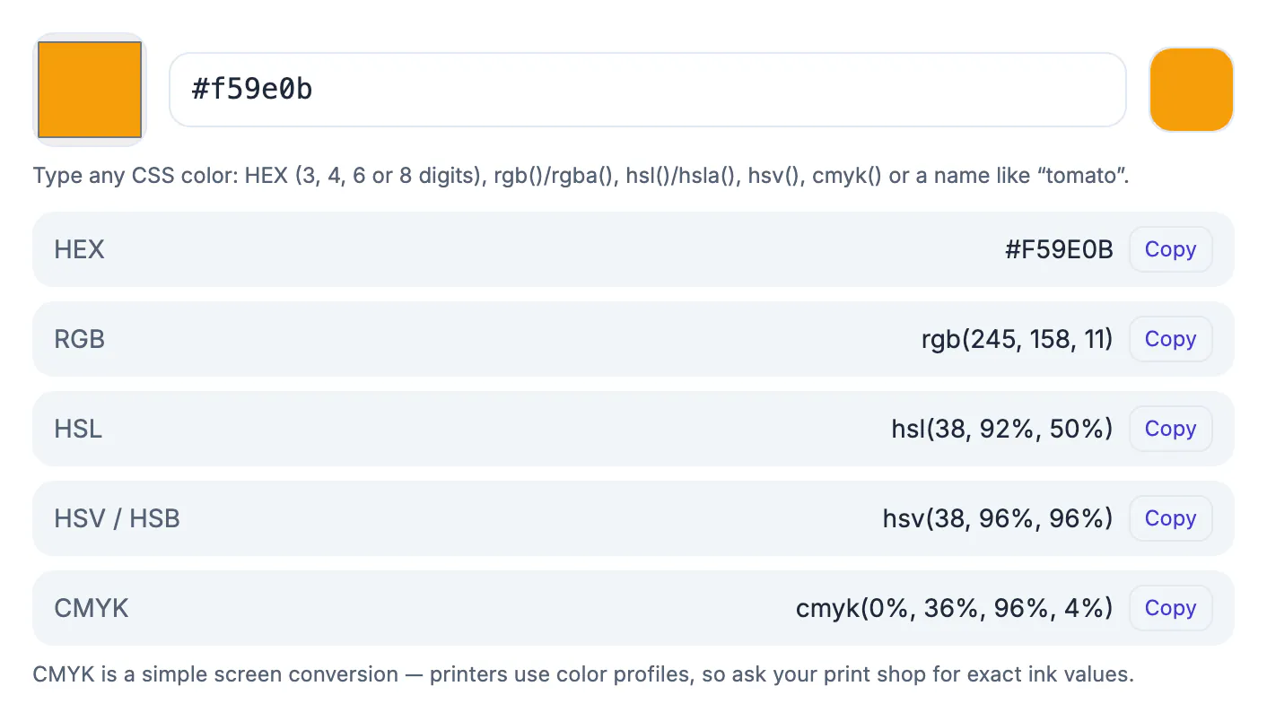
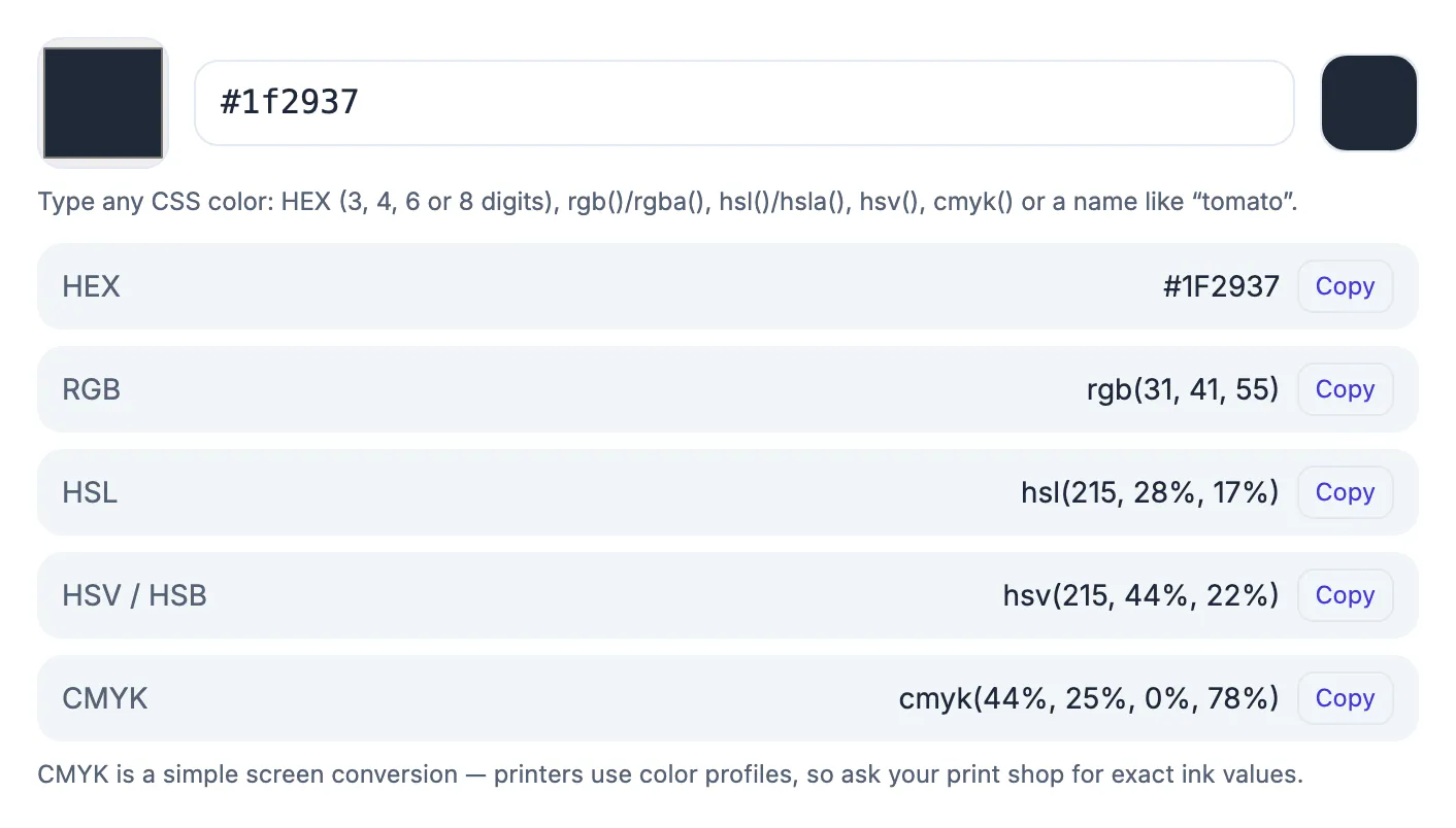
An accent draws the eye to the one thing you most want clicked. Picking a hue opposite the primary on the color wheel gives contrast without clashing: for teal, a warm amber such as #F59E0B (rgb 245, 158, 11; hsl 38, 92%, 50%). Then add a dark neutral for text, #1F2937 (rgb 31, 41, 55; hsl 215, 28%, 17%), and a very light one for backgrounds such as #F8FAFC.
Use the 60-30-10 guide as a starting point: about 60 percent of a layout in the light neutral, 30 percent in the primary and 10 percent in the accent. It is a rule of thumb, not a law, but it stops accent colors from taking over.
Check contrast before you commit
Readable text needs enough contrast between text and background. WCAG asks for a ratio of at least 4.5 to 1 for normal text and 3 to 1 for large text. For this palette (computed from the WCAG formula):
- White text on the teal primary: 5.47 to 1, which passes.
- Slate #1F2937 text on white: 14.68 to 1, which passes comfortably.
- White text on the amber accent: 2.15 to 1, which fails, so use the dark slate on amber instead (6.83 to 1).
- Teal text on amber: 2.55 to 1, which fails; do not put the two together as text and background.
Run your own pairs through the Color Contrast Checker. Also test for colour-blind readers: never use color alone to tell states apart.
Where to find and store the colors
Pulling colors from a photo works well for a starting point: the palette extractor reads a logo or picture, and the Color Palette tool helps explore related shades. Write the final values in one place, a note or a style guide, with a name for each role (primary, accent, text, background) and all formats you need. Keep at least one lighter and one darker tint of the primary for hover states and borders.
Testing the palette on real designs
A scheme that looks fine as swatches can fall apart on a page. Apply it to a landing page, a slide and a social graphic, then judge whether the hierarchy is clear. Buttons should stand out, body copy should be easy on the eyes, and backgrounds should not compete with content.
- Use the primary shade for one or two main elements per screen.
- Reserve the accent for the single action you want people to take.
- Keep neutrals for backgrounds, borders and body copy.
- Check the design in dark mode and in greyscale.
For exact values, converting RGB to HEX and converting HEX to RGB and HSL show the math, and extracting a palette from an image gives a starting point when you already have a logo or photograph.
Keeping the brand consistent over time
Write the final values, with names and approved uses, in a short brand sheet. Share it with designers, printers and developers. Print shades vary from screen shades, so ask your printer for a proof and adjust before ordering a large run.
Getting feedback before you finalise
Show the scheme to a few people who have not seen it and ask what mood it suggests. A bank wants trust and calm, a children's brand wants energy, and a wellness studio wants softness. If the reaction does not match your goal, adjust saturation and lightness before changing the hue family. Test the options on a phone outdoors in daylight as well as on a monitor, because brightness and glare change how tones read.
Keep a short list of rejected options and the reasons, so the team does not revisit them in six months.
Step-by-step
Common mistakes to avoid
Pro tips
Frequently asked questions
How many colors should a palette have?
Three to five is enough for most projects: a primary, an accent, a dark text color, a light background and optionally one status color.
What is the 60-30-10 rule?
A layout guide: about 60 percent of a design in a dominant neutral, 30 percent in a secondary color and 10 percent in an accent.
Which color format should I use?
HEX for web and design apps, RGB or HSL in CSS, and CMYK for print, where you should ask the printer for exact values.
How do I know if my colors are accessible?
Check the contrast ratio of each text and background pair. WCAG asks for 4.5 to 1 for normal text and 3 to 1 for large text.
Is the Color Converter free?
Yes. It runs in your browser with no sign-up and converts between HEX, RGB, HSL, HSV and CMYK.
A good palette is small: one primary, one accent, a dark text color and a light background. Build it in HSL, write the values in every format you will need and check every text pair for contrast before you use it.
Related guides
Browse more: all text and developer guides · Color Converter (HEX RGB HSL)